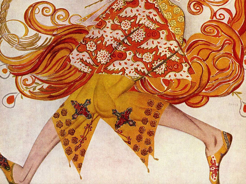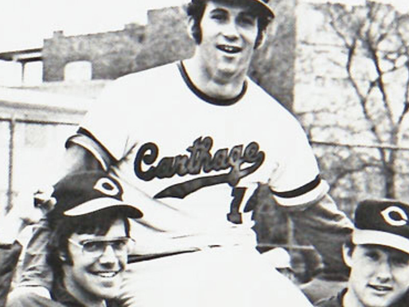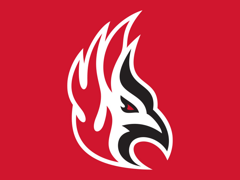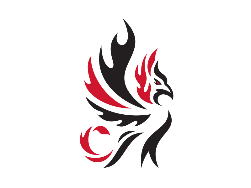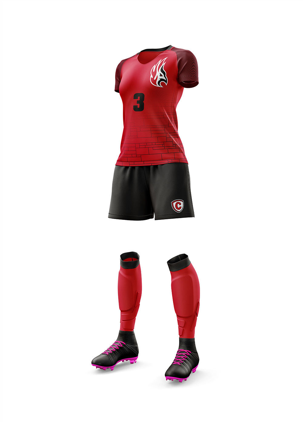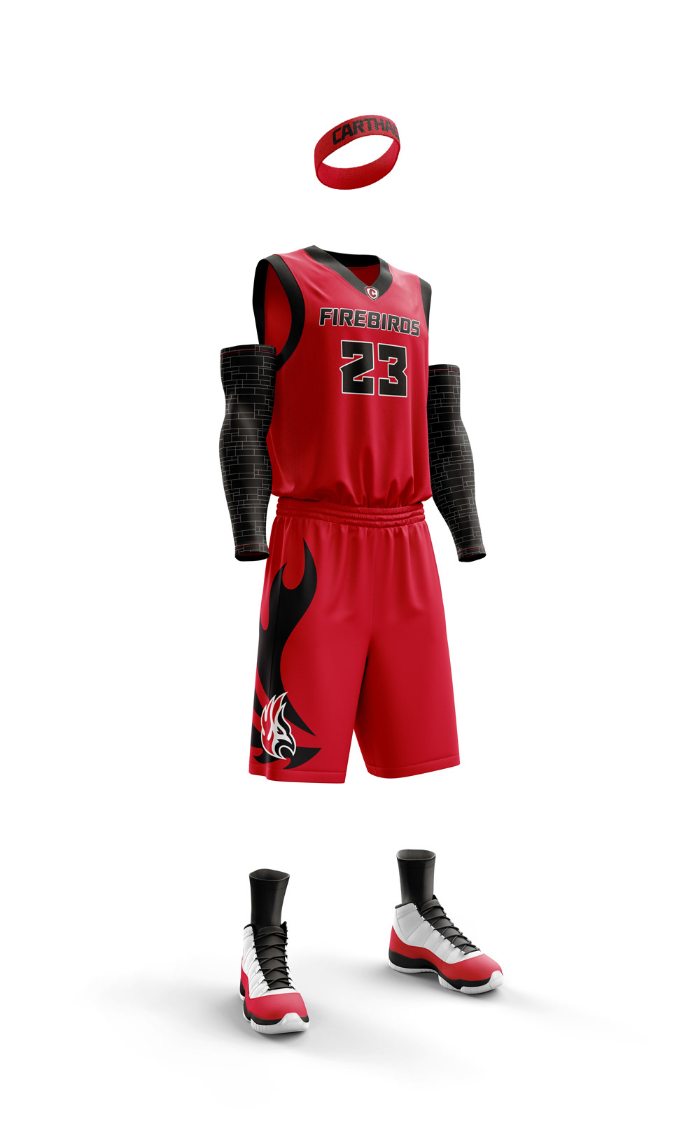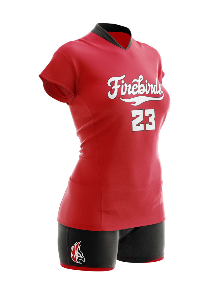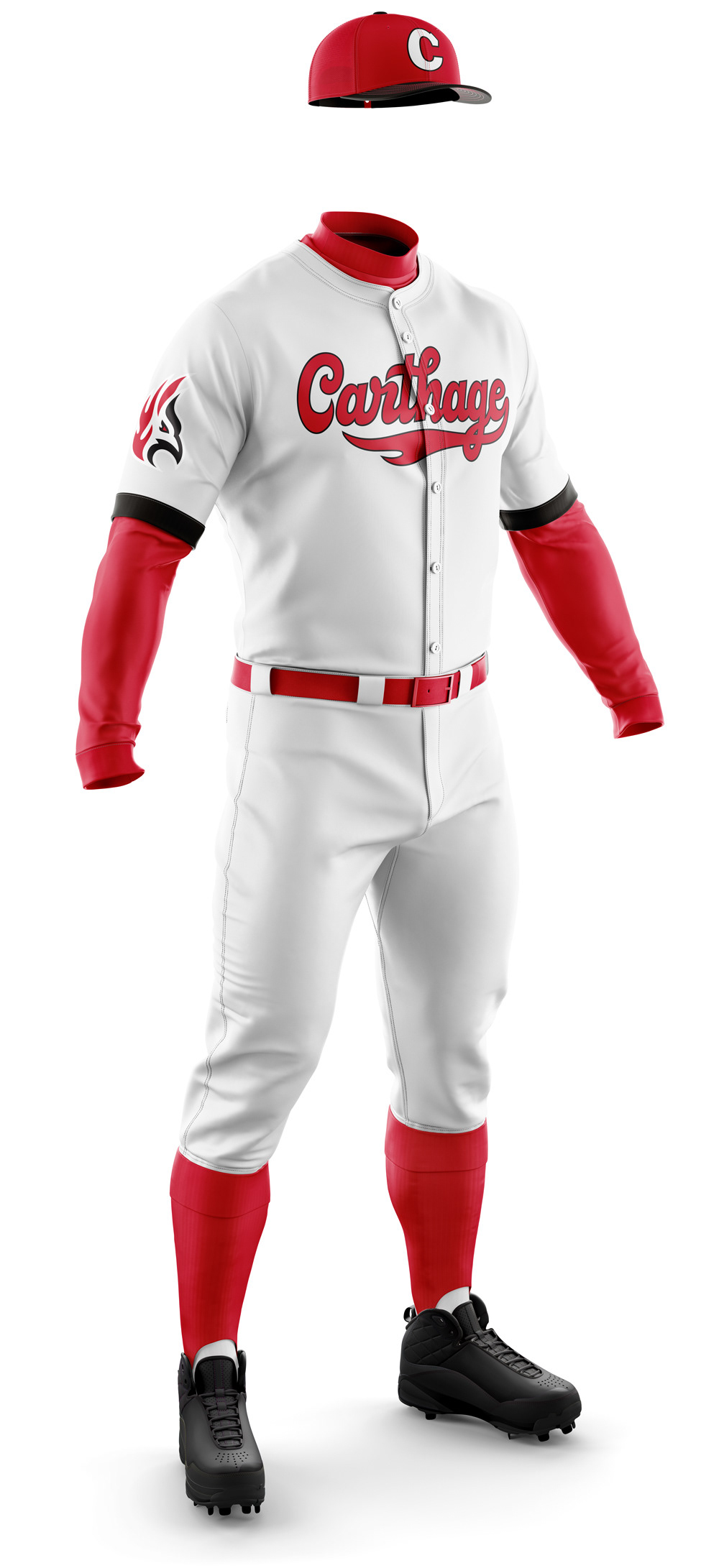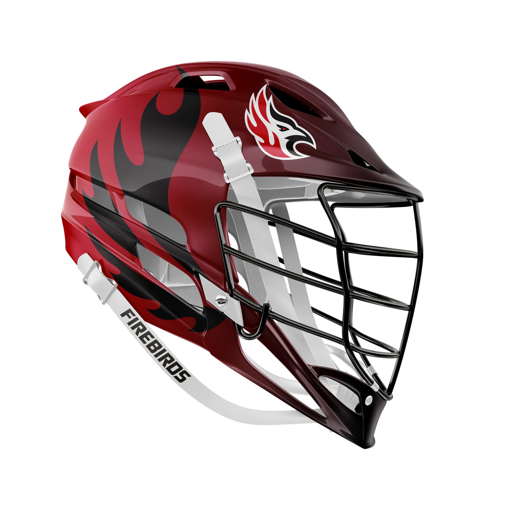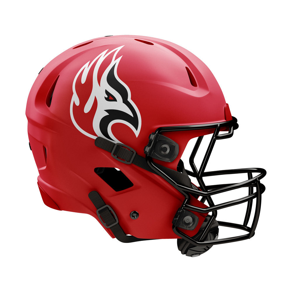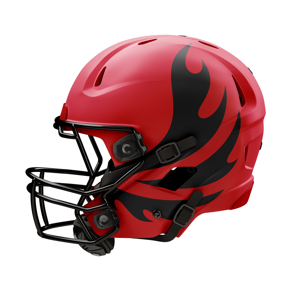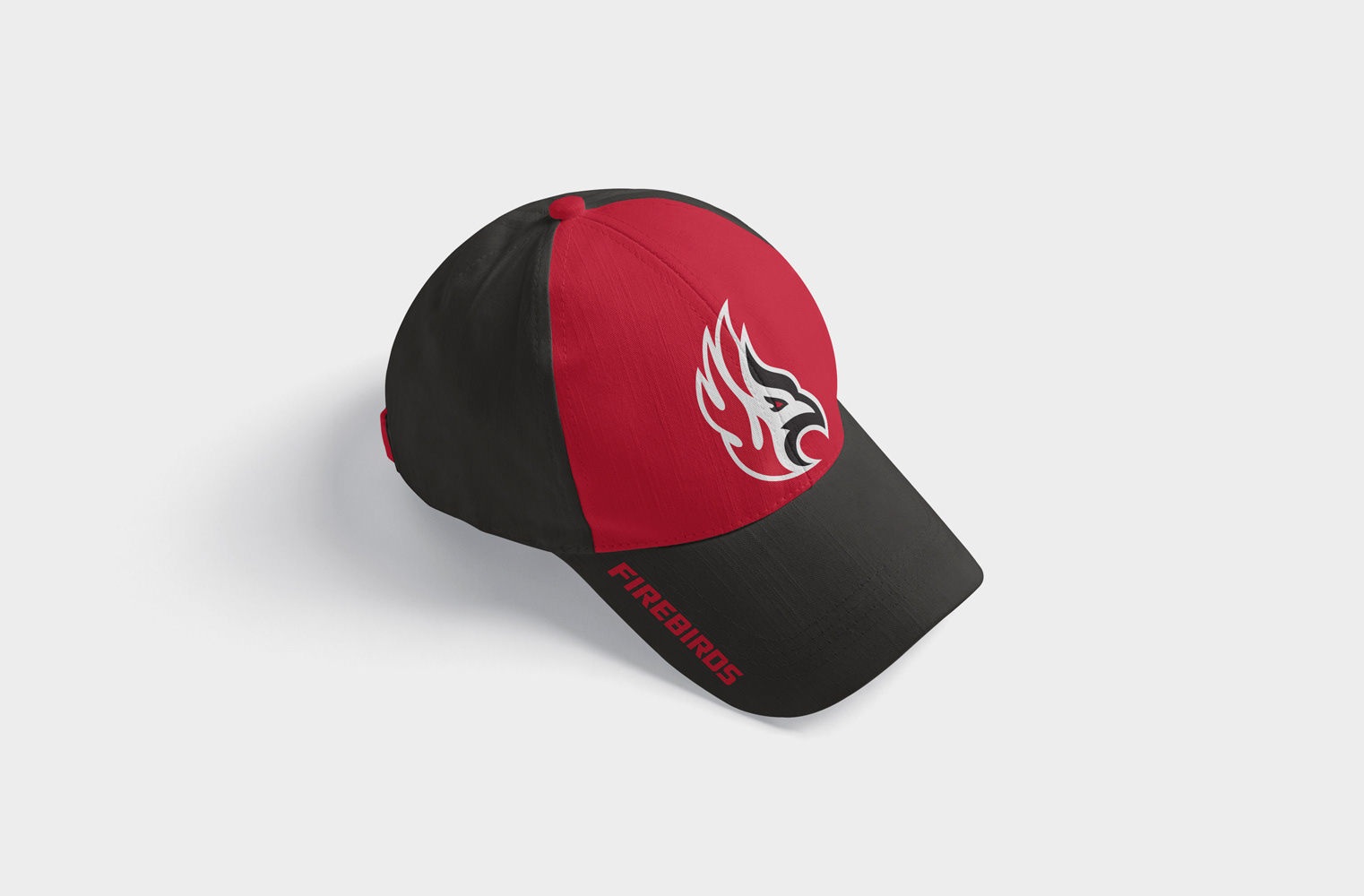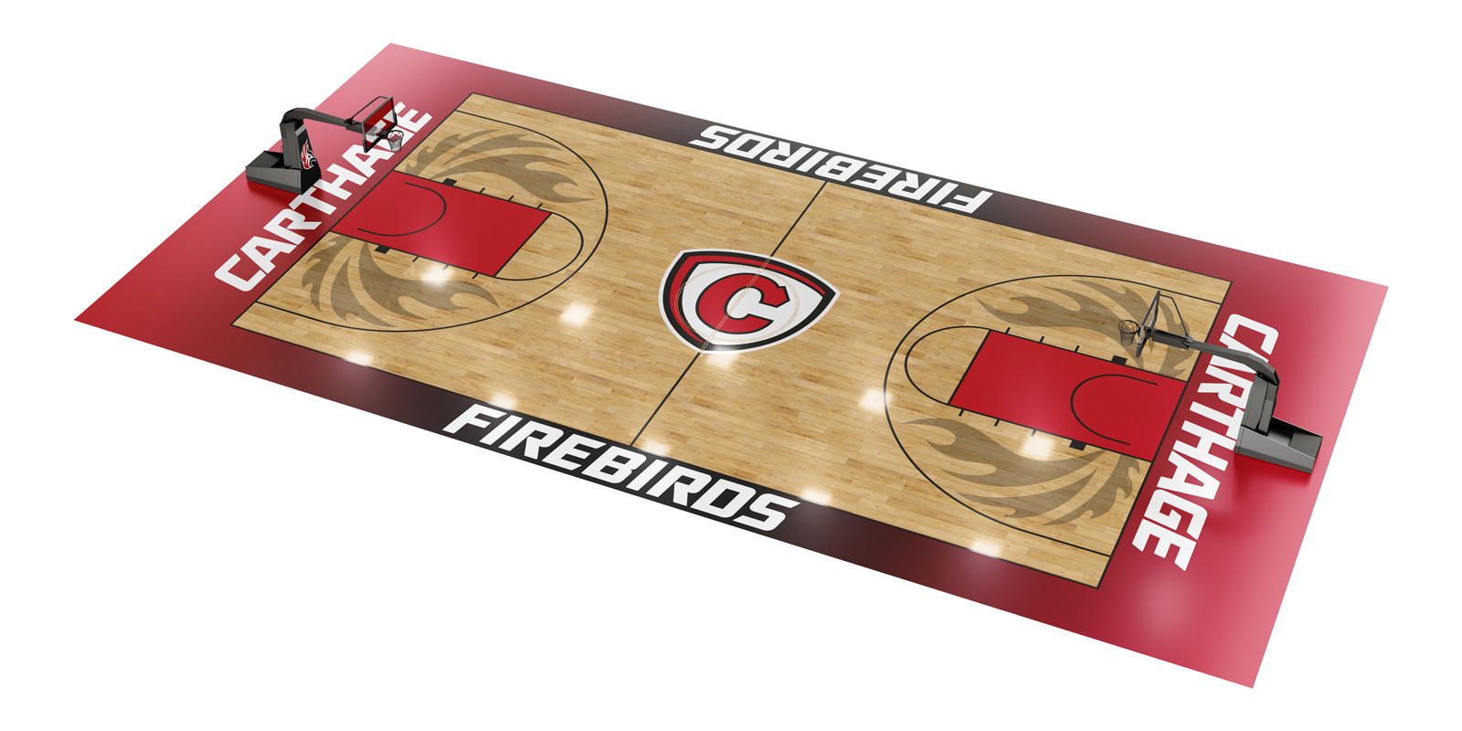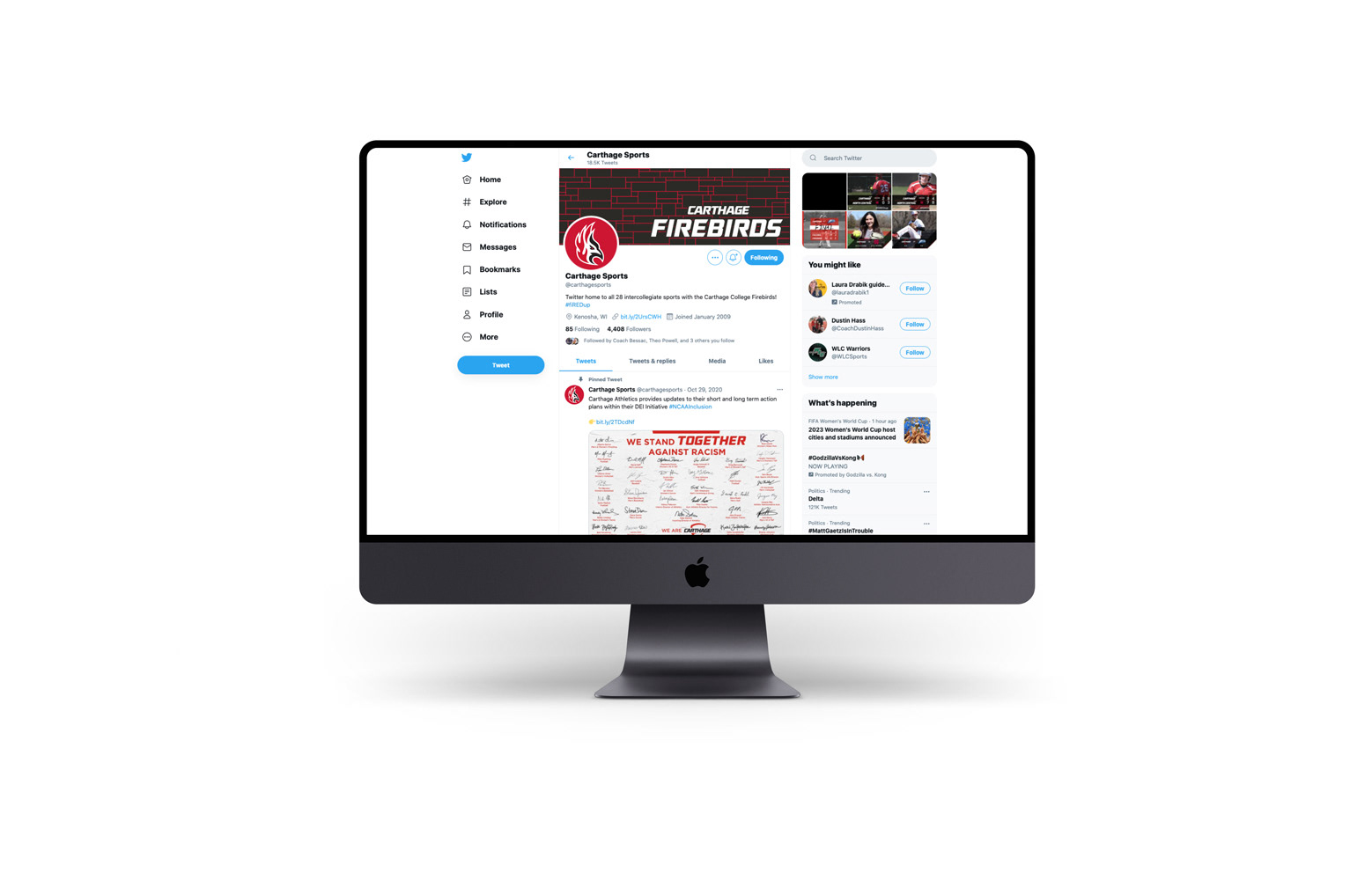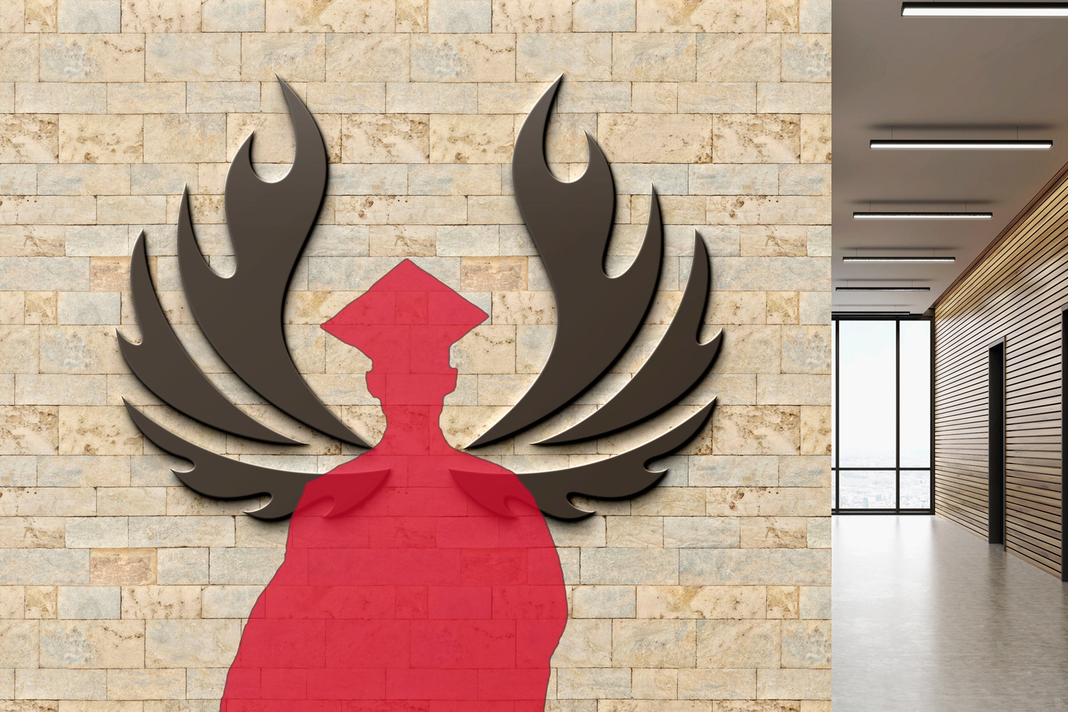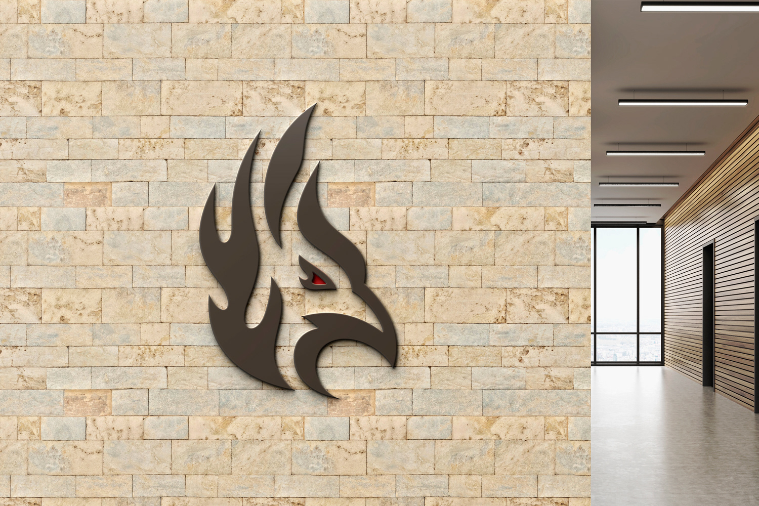


After retiring the names “Red Men” and “Lady Reds” in 2020, Carthage Athletics selected their new moniker in February 2021. After a five-month search with input from alumni, students, faculty, staff, and fans, they decided to be known as the Carthage Firebirds. As with the 2006 rebranding, I was honored to help Carthage start the Firebird era. I took inspiration from “The Firebird” ballet, the myth of The Firebird, and the school’s rich history. The primary goal was to create something bold, unique, and simple enough people could draw it from memory. I also wanted some structures of the logo to be able to carry over to other branding elements. For example, the flaming feathers styling can be translated to future graphics and illustrations. The wordmarks were created previously by the school, and the Shield logo I originally created in 2006 will remain as the primary mark. The Firebird head logo will become the school’s secondary mark. Paired with this is a full-bodied Firebird option that is a bridge to the Firebird wings graphic. These wings can be used on the sides of helmets, uniforms, or even as a on campus structure for students and alumni to take photos with and declare “I am a Firebird!” The two script marks were created based off scripts that the baseball and softball teams wore in the 1990s, along with a script the basketball team wore in the 1970s. They were modernized and elements connecting them to the new Firebirds name were added. Along with these logos, a Lannon stone pattern was created for the school to use in any number of ways. Nearly all the buildings on campus feature this pattern of stones quarried from a nearby quarry, and now the school can use this in marketing materials or on uniforms.
