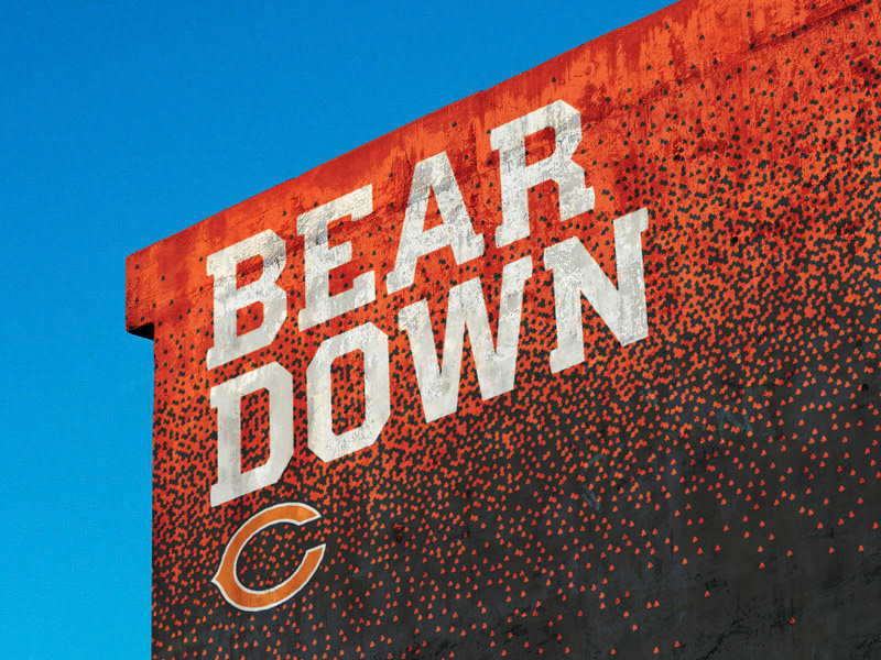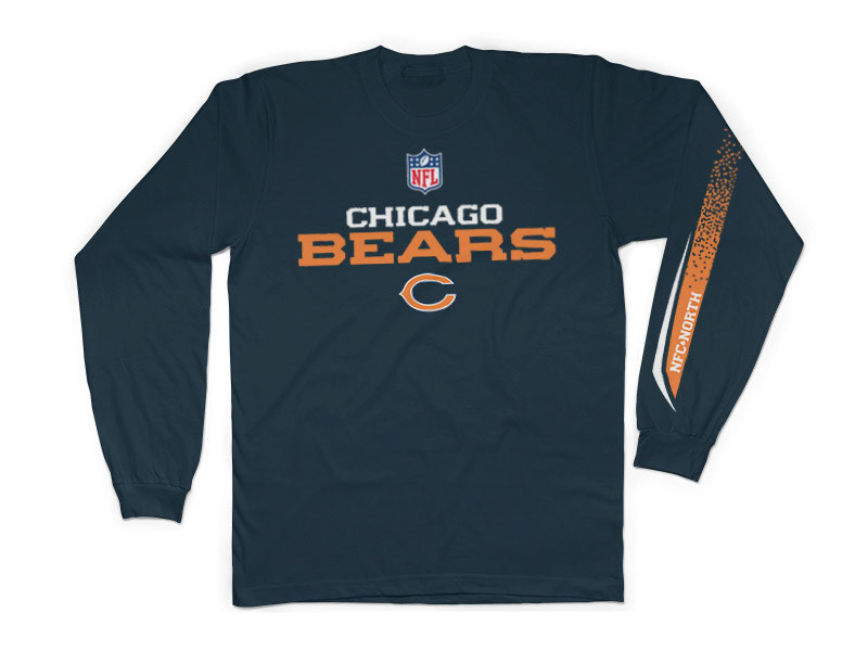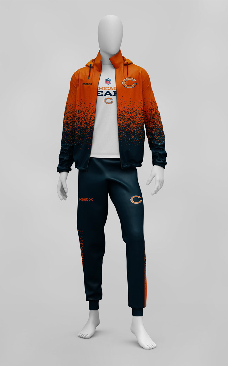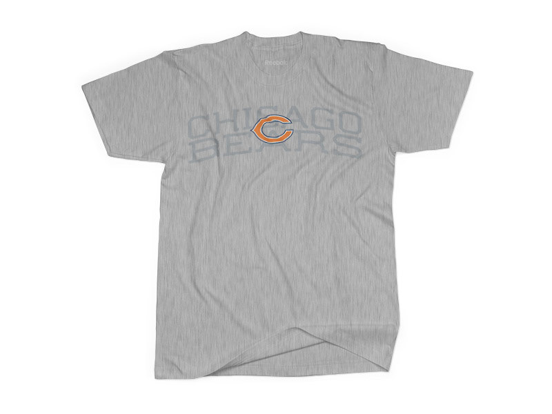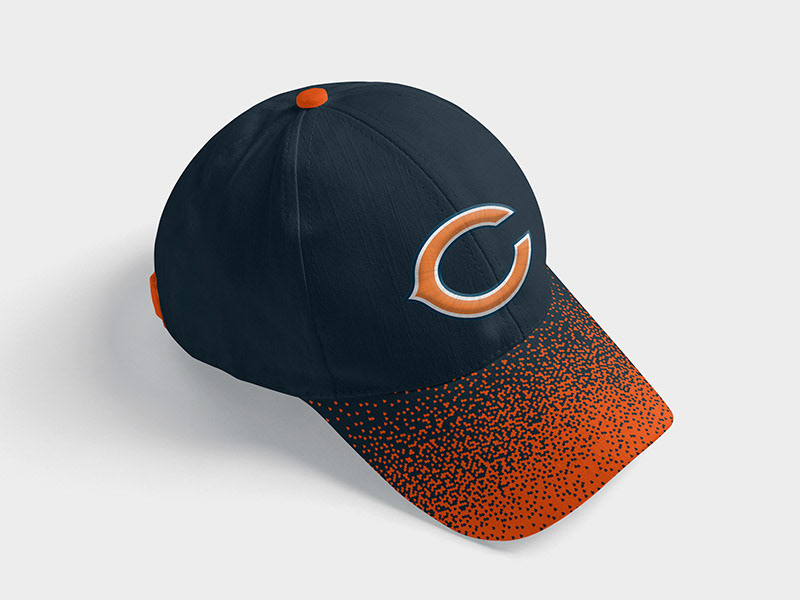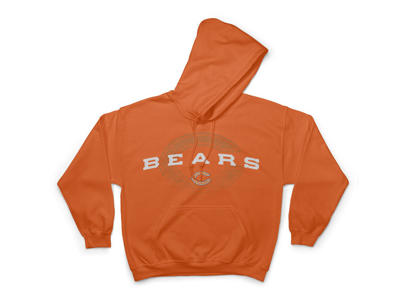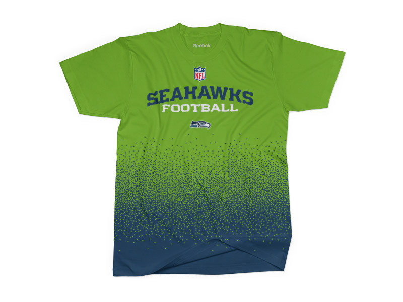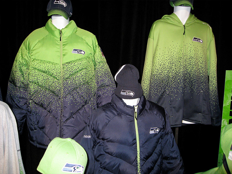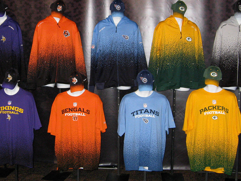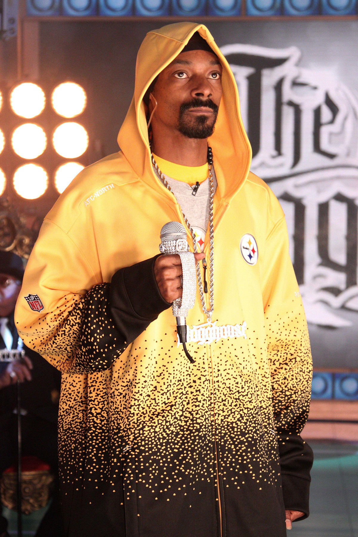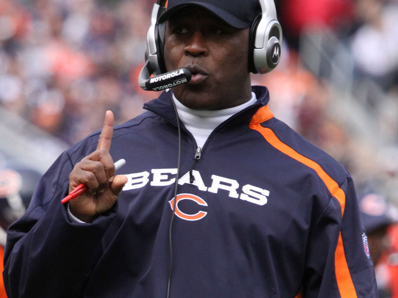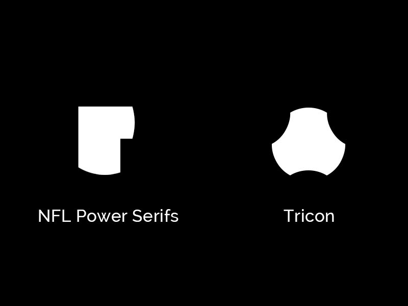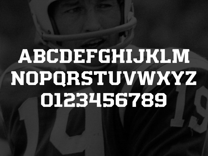


My first role at Reebok/Adidas was as a graphic designer for NFL apparel. In 2008, Andy Sterlachini and I were the graphic designers tasked to create graphics for the 2009 NFL Sideline collection. Font With creative direction from Leon Imas, I developed a new font for the NFL Sideline named NFL Power. (An italicized version was used for NHL apparel for multiple seasons as well!) The font featured curved serifs that were inspired by cut lines from the apparel. Two weights and three widths were created for long and short team names. Drift Pattern The serifs from the font also led to the Tricon symbol. This symbol became an icon in some graphics as well as the basis for a pattern called Drift. This pattern was developed with creative direction from JJ Stelter and was featured on graphics, outerwear, jackets, headwear, and marketing materials for Reebok product. The fade was created by adding and removing the Tricon elements one by one. Graphics Using all the elements, we created three key graphics that told a story throughout the season. A few elements were present in all graphics: A slight arch that was 11° for 11 players and the NFL Power Font. In the preseason, a subtle team name was printed using gel directly on the garment which created a ghosted effect. The intent was when a player would sweat, the name would darken even further. The main season graphic featured a sleeve print that would switch sleeves depending on the team's conference. (NFC left arm, AFC right arm) The left/right story continued throughout the line on other garments. The tee collection was completed with a simple arched team name and a tonal team logo that disappeared with the Drift pattern.
